

WorldPop Director Professor Andy Tatem argues that national averages can hide big differences between communities, making detailed local population data essential for ensuring schools, healthcare, housing, and other services are delivered where people need them most.
Many news stories on global population trends follow a familiar script: the world is getting older, growth is slowing, some countries are booming while others are shrinking. All true. But zoom into any single country and that neat narrative can start to fall apart. A country’s population pyramid is really an average of hundreds or thousands of different local stories. Increasingly, those local stories are the ones that matter for planning schools, hospitals, water systems, urban development and climate adaptation. Two recent pieces of research highlight this point.
One country, two demographic worlds
A new WorldPop global dataset1 stitches together subnational population estimates disaggregated by age and sex, covering 2010 to 2030 for nearly a million administrative units in 242 countries. Maps of these data reveal unique insights into subnational population structure patterns for the first time.
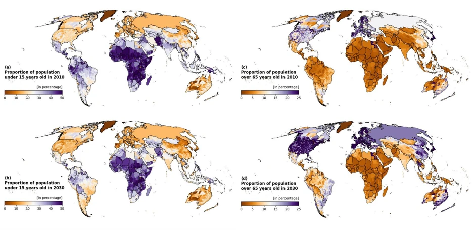
The maps of the data above show the share of the population under 15, and the share aged 65 and over, for 2010 and again for 2030. Look at the maps side by side and a few things jump out. Youthful populations are still heavily concentrated across sub-Saharan Africa and parts of South Asia in 2010, but by 2030 the picture has visibly shifted. The youth bulge is easing in many places even as it persists sharply in others. Meanwhile the older-age map shows the opposite motion, with pockets of Europe, East Asia and the Americas deepening in shade as the 65+ share climbs higher still.
What makes this dataset different from the national population pyramids you’ve probably seen before is that it tells the story at subnational scales. Differences in proportions and their changes over the twenty-year timescale can be seen within countries. East-west divides in Brazil and China, and north-south divides in India and Nigeria are evident. Canada, the US and Australia all show a patchwork of differences and trends. This is where things get interesting, because national figures can be almost meaningless as a planning tool once you get below them.
The urban close-up
This is exactly what a complimentary study2, found when it tracked age, sex and migration patterns across more than 10,000 cities worldwide from 2000 to 2020. The headline global number is a shift toward younger, working-age-heavy cities, but the city-level detail tells a much messier and more useful story. Take Nigeria: Lagos has a dependency ratio (the number of non-working age dependents (children aged 0–14 and older adults aged 65 and over) to the working-age population (aged 15–64)) of 0.47, representing a young, working-age-heavy city primed for economic expansion. Kano sits at nearly double this with a ratio of 0.83, driven by a much larger share of children. Two major cities in one country, with very different demographic profiles and, as a result, different needs: schools and maternal health services prioritised more strongly in one, jobs and housing for young workers in the other. Ethiopia shows the same pattern in miniature. The small town of Bore had the highest dependency ratio measured in 2020 in the study (1.26), while the capital Addis Ababa, a short flight away, sat at 0.34. A national average smooths right over these differences.
This isn’t a new observation for demographers who work below the national level and is a recurring finding wherever anyone has looked closely enough. Research mapping fertility3 across dozens of low- and middle-income countries has found that “hot spots” of high fertility and “cold spots” of low fertility often sit right next to each other, and sometimes spill across international borders entirely, tracking shared culture or geography rather than national policy.
Why this matters beyond the maps
Age structure drives a huge amount about how a place should cater to the needs of its citizens, including:
- Where to build what. A district bursting with children needs classrooms and maternal health clinics. A district full of working-age adults needs jobs, transit and housing.
- Who’s vulnerable to what. Heat exposure is rising faster in some cities than others, and those with older populations face sharply higher health risks from that same heat. Age structure and climate vulnerability are tangled together at the local level in ways a national average simply can’t capture.
- Where growth is coming from. Migration versus natural increase matters for planning, and it can vary substantially even between cities in the same country. In Burkina Faso, Ouagadougou’s growth has been driven mostly by migration, while nearby Koudougou has grown almost entirely through births outpacing deaths.
A complication: the data itself is under strain
All of this depends on the underlying census and survey data, but there is a quiet crisis in population data4 collection going on. During the 2010 census round, 93% of the world’s population was covered by a published national census. By the 2020 round, that had slipped to 85%, and as of mid-2024 close to a quarter of the world’s population lived in a country that had conducted a census but not yet published the results. COVID-era disruptions that many statistical offices never fully recovered from, shrinking government statistics budgets, declining public trust that makes people less willing to respond, and cuts to the international programs that used to backstop weaker national systems have all contributed to the crisis.
This all matters directly for the kind of maps and datasets discussed above. Every gridded population dataset, every city-level dependency ratio, every subnational fertility estimate is ultimately built from census, survey and administrative record inputs. Modelling can interpolate and extrapolate, but it can’t invent data that was never collected.
The bigger picture
The case for investing in subnational data collection, modelling, and the census systems underneath both seems clear. This is not as an academic nicety, but as the actual resolution at which health ministries, city planners and humanitarian agencies have to make decisions. The more granular and reliable the population data, the better the odds that a school gets built where the children actually are, and a clinic gets built where the elderly actually live.
The world’s demographic transition isn’t happening as one global wave, or even as 200+ separate national waves. It is happening village by village, city by city, district by district, in patterns that a country-level statistic will always average away. Demographic transitions are real, but they are not happening evenly and holding onto our ability to see that clearly is now part of the story too.
Image: Children in small village. Senegal, Scott Wallace / World Bank, 2007, CC BY-NC-ND 2.0
1 Global subnational population estimates disaggregated by age and sex for 2010–2030 (VeriXiv)
2 Global divergence in urban demographic change and migration patterns (Nature Cities)
3 Geographical distribution of fertility rates in 70 low-income, lower-middle-income, and upper-middle-income countries, 2010–16: a subnational analysis of cross-sectional surveys (The Lancet Global Health)
4 Disappearing people: A global demographic data crisis threatens public policy (Science)